Four real banners
Each of these is a signature drawn by the product's engine, with the banner under it as the reader gets it.




























Ten kinds, with wording
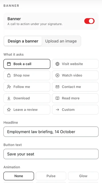
The builder offers ten kinds of call to action. The kind sets the icon and a starting label; the words are yours. Here is what each suits, and wording one of our example banners used.
| Kind | Use it for | Example headline and button |
|---|---|---|
| Book a call | A call, a viewing, a consultation: anything with a calendar behind it. | What is your home worth this spring? Book a valuation |
| Visit website | Somewhere specific on your site, such as new work or a collection. | Taking on projects from January See my work |
| Shop now | A product or an offer, with the page it can be bought on. | The autumn edit is here Shop the edit |
| Watch video | A demo or a talk, linked to where it plays, with its sound. | Tallyfield in two minutes Watch the demo |
| Follow me | A channel you post to often enough to be worth following. | New pieces every Friday Follow along |
| Contact me | Something people should send you or ask you about, such as a role. | Now hiring: product designers See open roles |
| Download | A checklist, a guide or a CV: one file worth having. | Your year-end tax checklist Get the checklist |
| Read more | A briefing, a case study or a post that explains something. | New employment rules, explained Read the briefing |
| Leave a review | After a stay, a project or an appointment, while it is fresh. | Enjoyed your stay? Tell us Leave a review |
| Custom | Anything else, such as volunteering or an appeal. | Kitchen volunteers wanted on Saturdays Volunteer with us |
What makes one worth clicking
- One ask. The icons already offer your channels. The banner is for the single next step you most want.
- A verb that says what happens. "Book a valuation" tells the reader what they will get; "Learn more" does not.
- A reason in the headline. A date, a season or a benefit: "Parents' evening, Thursday 5 November" beats "Book now".
- Short. The builder stops the headline at 40 characters and the button at 28; shorter still reads faster.
- A page that does what the button says. A "Book a call" button should open a booking page, not your home page.
- An end. An offer that ended last month, still under every email, says nobody is minding it. With campaigns, a banner can be given an end date and comes down by itself.
Motion, used sparingly
A banner can move: Pulse, Glow, Shimmer, Attention, Slide. Each draws the eye to the button for a moment and then rests, and each starts on its finished frame, so a reader whose mail app does not animate sees the whole banner. Choose one, and let the photo above it be the only other thing that moves.
Knowing whether it works
Every click on a banner is counted on your dashboard while link tracking is on, beside the clicks on your other links. Run it as a campaign and you also get banner loads and a click-through rate, labelled approximate, because some mail apps load pictures before anyone reads the email. Change one thing at a time, the headline or the button, and compare the next 30 days with the 30 before, which the Analytics page shows side by side.